React Navigation half modal with backdrop close

One of the most used components in front-end development is modals. It has a lot of use cases, for example, you can use modals as a select component for filtering lists or alert dialog, etc.
React Navigation offers really good API to create modals. In this tutorial, we will learn how to make a half-modal with backdrop close functionality.
First of all, We need to create our root navigation and a simple screen to open a modal over it.
In the code above, you can see we have another group for the modal. Group API comes with React Navigation 6. it's useful to change the behavior of the stack without creating another one. here we used transparentModal for presentation which means we can give style for the modal content. and headerShown is false because we don't need to see the header in this modal screen.
import * as React from 'react';
import { View, Text } from 'react-native';
import { Button } from 'react-native-paper';

import { NavigationContainer } from '@react-navigation/native';
import { createStackNavigator } from '@react-navigation/stack';
import ModalScreen from './modal';
function HomeScreen({ navigation }) {
  return (
    <View style={{ flex: 1, alignItems: 'center', justifyContent: 'center' }}>
      <Text style={{ fontSize: 30 }}>This is the home screen!</Text>
      <Button
        style={{ marginTop: 40 }}
        mode="contained"
        onPress={() => navigation.navigate('MyModal')}>
        Open Modal
      </Button>
    </View>
  );
}
const RootStack = createStackNavigator();

function App() {
  return (
    <NavigationContainer>
      <RootStack.Navigator>
        <RootStack.Group>
          <RootStack.Screen name="Home" component={HomeScreen} />
        </RootStack.Group>
        <RootStack.Group
          screenOptions={{
            presentation: 'transparentModal',
            headerShown: false,
          }}>
          <RootStack.Screen name="MyModal" component={ModalScreen} />
        </RootStack.Group>
      </RootStack.Navigator>
    </NavigationContainer>
  );
}

export default App;
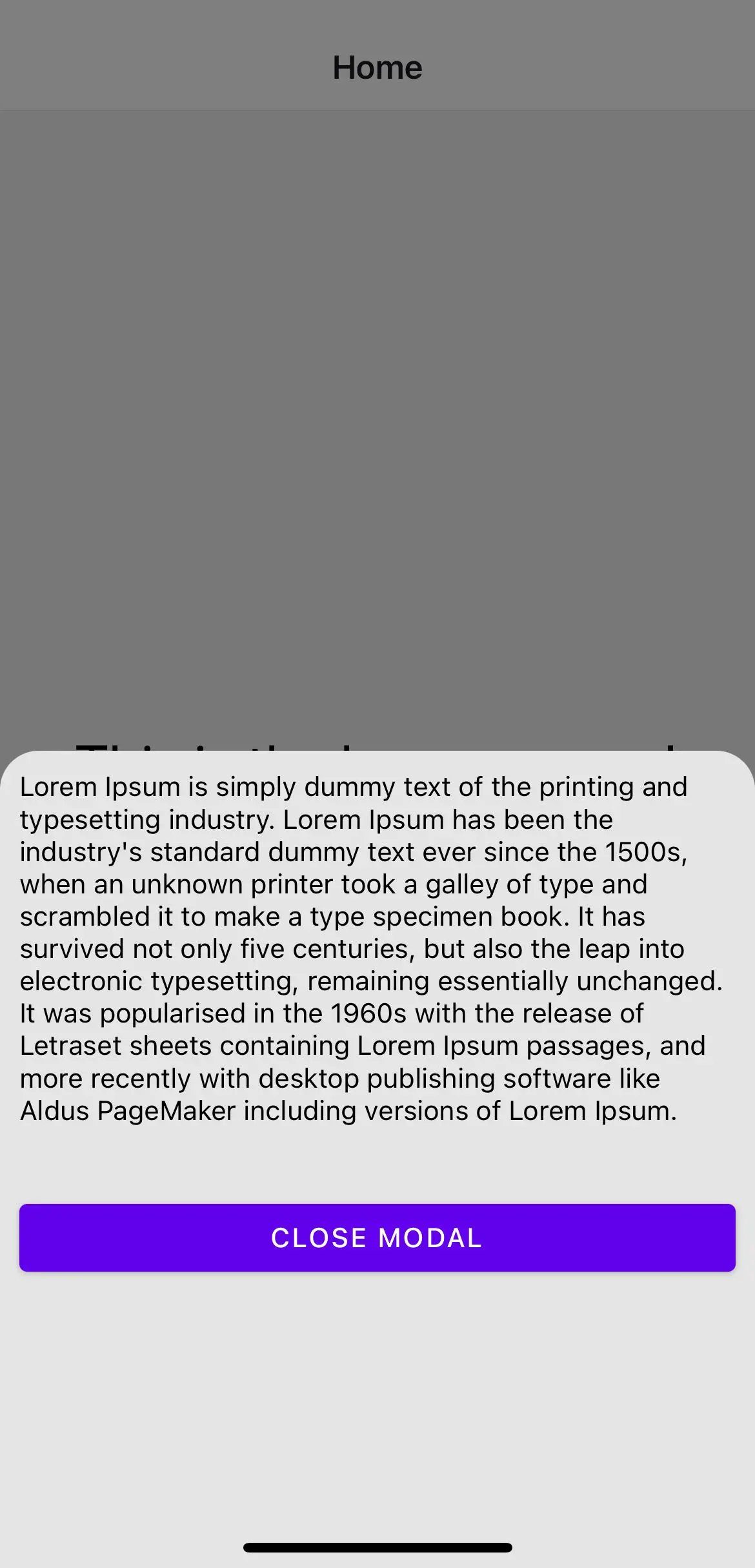
In the modal screen, we actually don't have any background color for the main view. but in the child component, there is Pressable the component that fills the entire screen. and the actual content is inside Animated.View and animates from the bottom to half of the screen.
import {
  Animated,
  View,
  Text,
  Pressable,
  StyleSheet,
  useWindowDimensions,
} from 'react-native';
import { useCardAnimation } from '@react-navigation/stack';
import { Button } from 'react-native-paper';

const styles = StyleSheet.create({
  viewAnimated: {
    width: '100%',
  },
  viewContainer: {
    flex: 1,
    padding: 10,
    backgroundColor: '#E5E5E5',
    borderRadius: 20,
  },
});
function ModalScreen({ navigation }) {
  const { height } = useWindowDimensions();
  const { current } = useCardAnimation();

  return (
    <View
      style={{
        flex: 1,
        alignItems: 'center',
        justifyContent: 'center',
      }}>
      <Pressable
        style={[
          StyleSheet.absoluteFill,
          { backgroundColor: 'rgba(0, 0, 0, 0.5)' },
        ]}
        onPress={navigation.goBack}
      />
      <Animated.View
        style={[
          {
            height: height,
            transform: [
              {
                translateY: current.progress.interpolate({
                  inputRange: [0, 1],
                  outputRange: [height, height * 0.5],
                  extrapolate: 'clamp',
                }),
              },
            ],
          },
          styles.viewAnimated,
        ]}>
        <View style={styles.viewContainer}>
          <Text>
            Lorem Ipsum is simply dummy text of the printing and typesetting
            industry. Lorem Ipsum has been the industry's standard dummy text
            ever since the 1500s, when an unknown printer took a galley of type
            and scrambled it to make a type specimen book. It has survived not
            only five centuries, but also the leap into electronic typesetting,
            remaining essentially unchanged. It was popularised in the 1960s
            with the release of Letraset sheets containing Lorem Ipsum passages,
            and more recently with desktop publishing software like Aldus
            PageMaker including versions of Lorem Ipsum.
          </Text>
          <Button
            style={{ marginTop: 40 }}
            mode="contained"
            onPress={navigation.goBack}>
            Close Modal
          </Button>
        </View>
      </Animated.View>
    </View>
  );
}
export default ModalScreen;